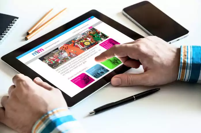
It was predicted that by 2014, the number of people using mobile devices to browse websites would surpass those using desktop computers. When local business Wallace Printers, based in Westhoughton, approached us in November 2013 to create a visually appealing, responsive website, we were excited to take on the challenge. They had seen the positive results from our own website and blog and were impressed with the outcome. Wallace already had a website, but it was built using Flash—popular many years ago but now outdated. As the web evolved, Flash sites became less functional and user-friendly, leaving businesses with websites that were difficult to find and even harder to use.
What is Responsive Website Design?
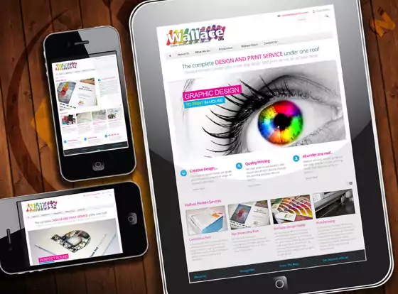
Responsive web design ensures that a single website works seamlessly across both desktop browsers and the wide range of mobile devices on the market. This design approach delivers the best possible browsing experience, whether someone is using a smartphone, tablet, netbook, or e-reader, no matter the operating system. Users on the go have different needs from those at a desk, and a responsive website automatically adjusts to the device being used, ensuring an optimal experience wherever it’s accessed.
The Difference Between Mobile and Full Desktop Websites
Desktop users get the full experience—videos, large images, and animations—while smartphones receive a simplified version that prioritises speed and usability. Tablets and netbooks receive a balanced interface somewhere in between, ensuring that the website remains visually appealing and functional across all platforms.
By embracing responsive design, Wallace Printers now has a modern, adaptable website that meets the needs of today’s users. If you’d like to know more about how we can help your business transition to a responsive website, get in touch with us at NW Design.